Preventing AI UI Regression in React With Visual Snapshots and Storybook Contracts
Jamie
Why “AI UI regression” happens in screenshot-to-app builds
Screenshot-to-app workflows are fast, but they introduce a specific failure mode: the UI looks correct at generation time and then silently drifts during follow-up prompts, refactors, dependency bumps, or “small tweaks” that an AI interprets as permission to reshape layout. In React projects, this drift often shows up as spacing changes, typography shifts, broken responsive behavior, or swapped component variants—issues that don’t always fail tests because the app still “works.”
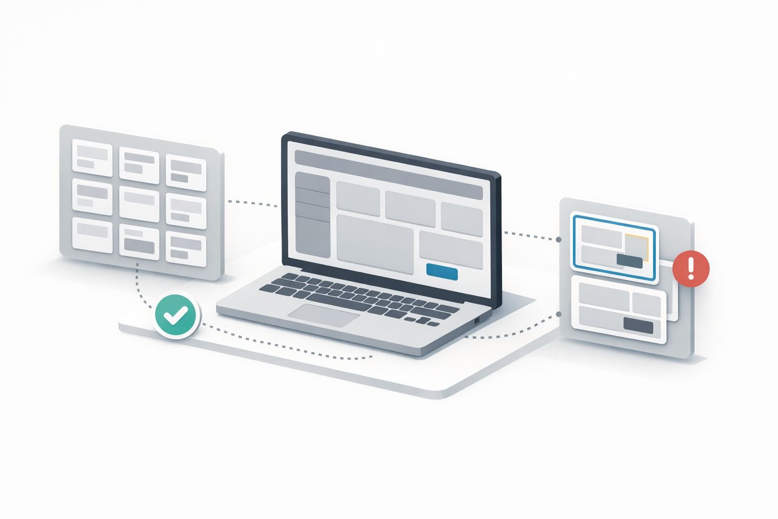
Preventing that kind of regression requires treating UI like an API. The safest pattern is a two-layer contract: (1) visual snapshot baselines that catch pixel-level drift, and (2) Storybook “component contracts” that constrain how generated or edited code is allowed to change over time. This combination is especially helpful when building iteratively from screenshots because each prompt can be a mini-redesign unless you lock down expectations.
The workflow overview
The workflow below is intentionally simple and repeatable:
- Snapshot layer: establish baseline screenshots for critical routes and key components, then run visual diffs on every PR.
- Storybook contract layer: define canonical component stories (states, sizes, edge cases) and treat them as a compatibility surface.
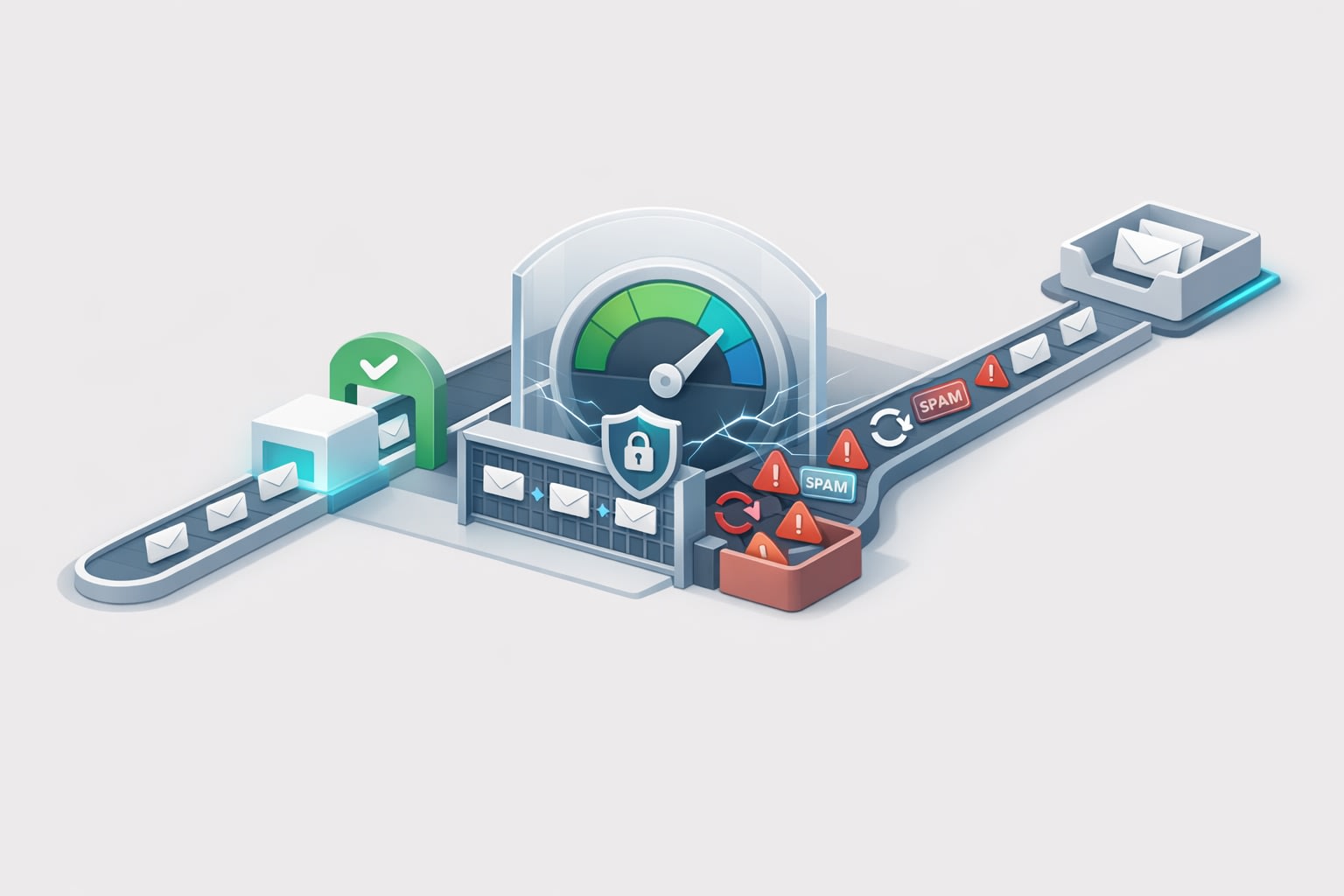
- Change gates: require explicit approvals for visual diffs and story changes, so “AI edits” don’t land unnoticed.
This setup works whether your UI code is human-written, AI-assisted, or generated from a screenshot. The point is that the project has an independent truth source: what the UI must look like and how components must behave.
Step 1: Build a snapshot baseline for real pages, not just components
Component snapshots alone won’t catch a lot of real regressions: container padding, route-level layout, stacked modals, or responsive breakpoints. Start with a small set of route-level snapshots that reflect revenue-critical or workflow-critical screens.
What to snapshot first
- Authentication edges: login, error states, empty states.
- Primary workflow: the “happy path” screen users see most.
- Data-dense views: tables, filters, side panels, and mobile breakpoints.
- Marketing surfaces: landing pages, pricing blocks, checkout steps.
Keep the initial scope small. Ten stable snapshots that run fast and fail loudly beat fifty flaky ones that nobody trusts.
Step 2: Turn Storybook into a contract, not a gallery
Storybook becomes much more than a design system showcase when you treat stories as a compatibility contract. The goal is to encode the intended component interface and its supported variants so that AI-generated edits can’t “invent” new behaviors without detection.
What a “contract story” includes
- Canonical states: default, loading, empty, error, disabled.
- Variant coverage: size and intent props (e.g., primary/secondary/destructive).
- Boundary cases: long labels, overflow, missing avatars, very large numbers.
- Layout contexts: inside a narrow sidebar, inside a dense table row, in a modal.
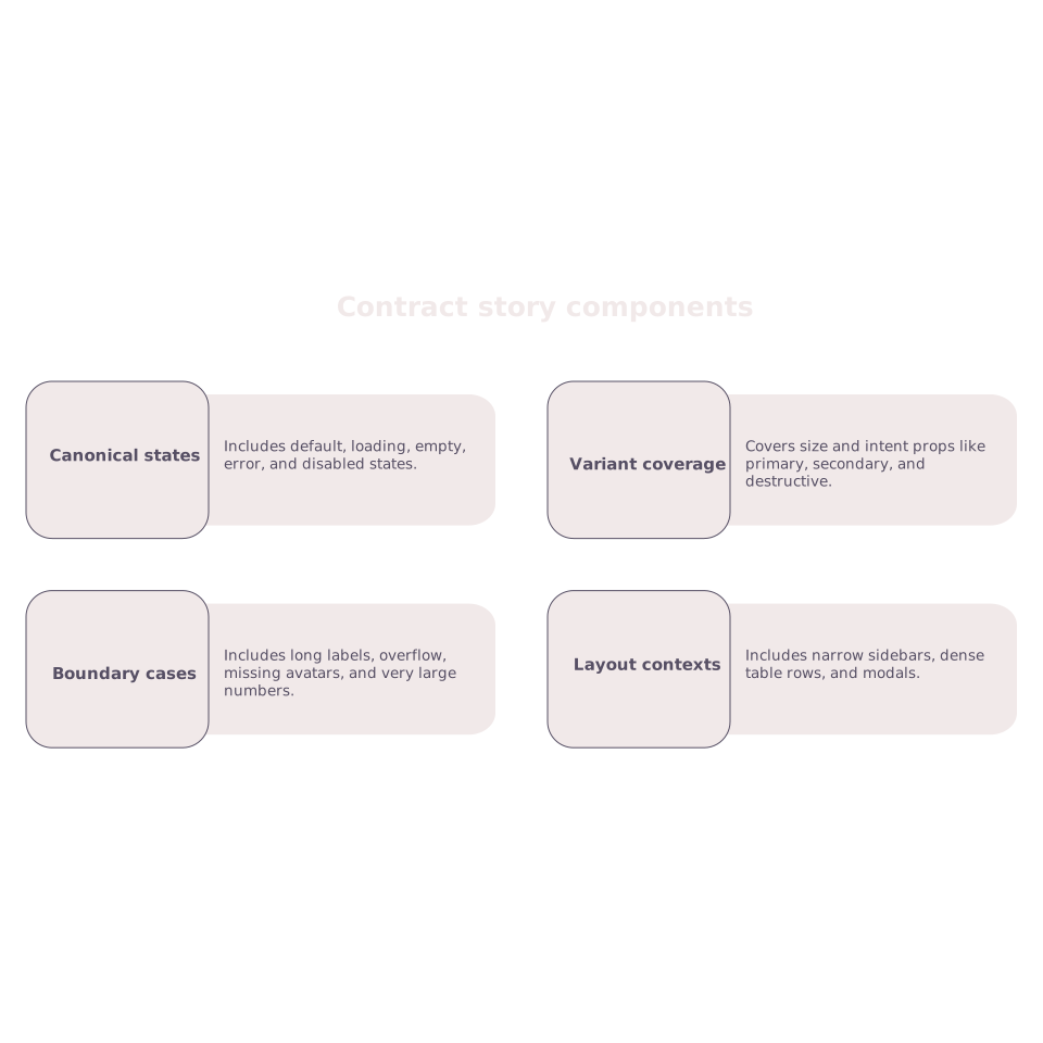
For screenshot-to-app builds, this contract is critical: if the AI swaps a component library primitive, changes a Tailwind class that affects height, or “simplifies” markup, the story diffs will highlight the break immediately.
Step 3: Add a visual test runner that diffs against Storybook
The most maintainable approach is to render Storybook stories in CI and generate screenshots for each contract story. When combined with route-level snapshots, you cover both component correctness and page composition.
Practical tips to keep diffs stable
- Freeze time and randomness: mock Date, seeded IDs, stable placeholders.
- Control fonts: load the same font files in CI and locally.
- Disable animations: global CSS to reduce flake and noise.
- Mock network data: avoid live APIs; use fixtures to keep visuals consistent.
If you’ve ever chased a “diff” that was just a different timestamp or a slightly different chart scale, you know why these guardrails matter.
Step 4: Define “allowed change” rules so AI edits don’t slip in
Visual regression tools are only useful if they create an explicit decision. In AI-assisted workflows, the most common failure is treating diffs as noise and approving them quickly. Instead, set simple rules:
- Any diff on a contract story requires a short written justification (one sentence is enough).
- Route-level diffs require a reviewer from outside the PR author (a second set of eyes catches accidental drift).
- Design tokens and shared components have stricter gates than leaf screens.
This mirrors how teams prevent analytics drift: you don’t accept unexplained changes in key numbers. The same principle applies to UI output. If you’re already thinking in terms of “drift,” the idea of a ladder of tolerances may feel familiar from modeling reporting delays; a similar mindset helps when deciding which UI diffs are acceptable and which are regressions. For a parallel in data systems, see the concept behind modeling reporting delays with a data-lag ladder.
Step 5: Make screenshot-to-app iteration safer with a code-first escape hatch
Screenshot-to-app tools are strongest when they get you to a working baseline quickly, then let you refine with real code. The most reliable setup is: generate from a screenshot, lock UI expectations with snapshots and stories, then iterate using pull requests and code review.
That’s also why teams tend to prefer builders that produce a standard React codebase from day one and sync cleanly to GitHub. lovable.dev is designed around that workflow: you can start from visual context, ship a real prototype quickly, then move into a conventional React stack where snapshots, Storybook, CI, and reviews work the same way they do in any mature engineering org.
Step 6: Contract boundaries for React components in practice
To prevent regressions that “look fine” in isolation but break usage sites, establish a few boundaries:
- Public props are stable: component props are a contract; changing them requires updating stories and consumers intentionally.
- Design tokens are centralized: spacing, radii, typography should come from tokens or shared Tailwind config, not ad-hoc classes.
- Composition rules are explicit: if a component must wrap children a certain way, encode it (and show it) in stories.
- Accessibility is tested as part of the contract: ARIA labels, focus states, keyboard navigation shouldn’t be optional.
When AI is involved, these rules reduce the “creative surface area.” The system can still help with repetitive scaffolding, but it can’t quietly reinterpret your UI language.
Step 7: Operationalizing the workflow in a team
The final piece is making the workflow predictable for humans. A few practices help:
- Label PRs that include AI UI edits so reviewers know to scrutinize diffs.
- Require a before/after screenshot in the PR description for any UI change.
- Keep a “UI contract checklist” for reviewers: responsive states, hover/focus, empty/error states, and long-content behavior.
This is similar to reducing integration noise: you create a repeatable checklist so changes don’t leak into places you aren’t watching. If your team struggles with noisy tool changes and unreviewed updates, the mindset overlaps with an integration debt audit checklist—except here, the “integration” is between visual intent and the React code that implements it.