A 30‑Minute Incident Retrospective with a Blameless Fault‑Tree Diagram
Jamie

Why a 30‑minute incident retrospective works
Most teams don’t skip incident retrospectives because they don’t care. They skip them because they feel heavy: too many participants, too much narrative, and not enough clarity about what actually broke. A 30‑minute incident retrospective is a lightweight alternative that focuses on a single outcome: turning a raw timeline of events into a blameless fault‑tree diagram you can act on.
The goal isn’t to write a perfect postmortem. It’s to capture the smallest useful model of the failure: what happened, what conditions made it possible, and what safeguards would have prevented or limited it—without turning the session into a debate about who missed what.
Inputs and roles you need before you start
The minimum inputs
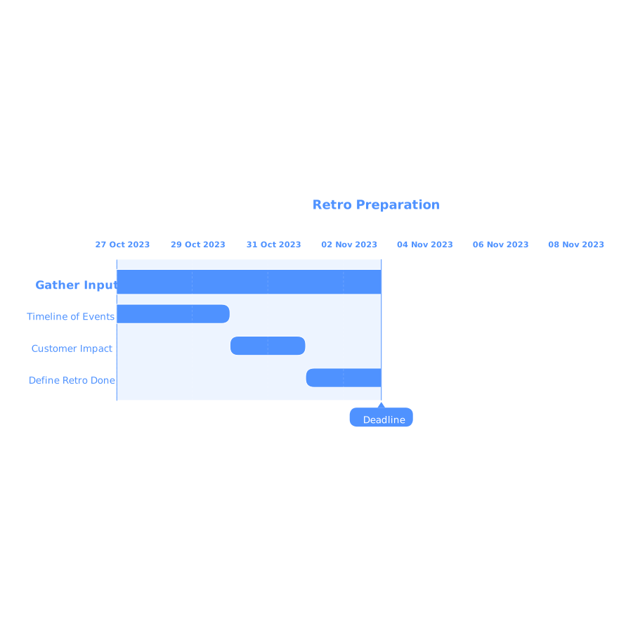
- A timeline of events (chat excerpts, deploy timestamps, alerts, support tickets, status page updates). Keep it chronological and factual.
- The customer impact in one sentence (what users experienced and for how long).
- The “definition of done” for the retro: a fault‑tree diagram plus 3–5 concrete follow‑ups.
Suggested roles (small by design)
- Facilitator: keeps time and enforces blameless framing.
- Scribe: edits the timeline live and captures follow‑ups.
- Two to four responders: people who touched the system during the incident.
If you invite more than six people, the session will drift. If you need broader visibility, share the diagram afterward.
The 30‑minute agenda
0–5 minutes: lock the timeline
Start by pasting the timeline into a shared doc. Only capture observable facts: alerts fired, dashboards changed, configs updated, rollbacks executed, customer reports arrived, and mitigations landed. Avoid interpretations like “we didn’t notice” or “the on‑call forgot.” Replace them with verifiable statements such as “no alert triggered for X” or “dashboard Y was not checked until 10:42.”
This is also where you define the impact statement and the incident boundaries. If you don’t agree on when the incident started and ended, you won’t agree on causes later.
5–12 minutes: extract the “event nodes” from the timeline
Convert the timeline into short, atomic nodes you can place into a diagram. Useful nodes often look like this:
- “Deploy 3f9a2 reached production”
- “Database CPU saturated”
- “Retries increased from 2 to 10”
- “Circuit breaker did not open”
- “Support received 14 tickets”
Keep nodes neutral. A node can represent a human action (“rolled back to version X”) but it should be phrased as an action, not a judgment.
12–25 minutes: build the blameless fault‑tree
A fault‑tree starts with the top event (the failure you care about) and decomposes it into contributing conditions. Unlike a simple narrative, it makes dependencies explicit.
Step 1: Define the top event. Example: “Checkout API returned elevated 5xx for 27 minutes.” Make it measurable.
Step 2: Add first‑level branches. Ask: “What had to be true for the top event to occur?” Typical categories include:
- Capacity or performance limits (resource saturation, scaling delays)
- Bad or risky change (deploy, config, data migration)
- Missing/failed safeguards (alerts, rate limits, circuit breakers)
- Detection and response friction (unclear ownership, noisy signals)
Step 3: Connect conditions using AND/OR logic. Fault‑trees become useful when they show combinations. For example, “database CPU saturation” might require both “unexpected query plan” AND “traffic spike.” Or the outage might happen if “primary dependency fails” OR “fallback path fails.” You don’t need formal notation; you need clarity.
Step 4: Add evidence from the timeline. Each node should point to at least one timeline event: a metric screenshot, a timestamped alert, a deploy record, a support spike. This keeps the discussion grounded.
Step 5: Identify leverage points. For each branch, ask: “Where would a change have prevented impact or shortened duration?” You’ll often find that the most effective actions are not in the code that failed, but in detection, limits, and safe rollout.
Using a text‑to‑visual workflow to keep it fast
The fastest way to get from timeline to diagram is to write the fault‑tree in clean text first, then convert it into a visual you can edit. This is where a tool like napkin.ai fits naturally: you can paste structured text (top event → branches → sub‑causes) and generate a clear diagram you can refine without fighting layout. The value isn’t “pretty”; it’s a shared model the team can read in seconds.
Keeping it blameless without making it toothless
“Blameless” doesn’t mean “nobody made mistakes.” It means you assume actions made sense given what people saw at the time. The language you use matters:
- Replace “Why didn’t we…?” with “What signal would have made X obvious?”
- Replace “Who approved this?” with “What was the decision context and guardrails?”
- Replace “We should have known” with “Which detection failed to surface this?”
This framing leads to fixes that scale: stronger alerts, safer deploy patterns, better runbooks, and clearer ownership boundaries.
Common fault‑tree patterns you’ll see again and again
1) Safeguard missing, not just a bug
Many incidents aren’t caused by a single defect; they’re caused by a defect reaching production impact because a safeguard didn’t catch it. Your tree should make that visible: “bad change” plus “no progressive rollout,” or “dependency slowdown” plus “no timeout budget.”
2) The “silent queue” branch
Incidents often surface first as a backlog: retries pile up, messages queue, jobs stall, support tickets arrive. If you’ve ever been surprised by customer‑reported issues, you may be dealing with a silent queue—signals accumulating out of sight. It’s worth mapping that branch explicitly and deciding what “queue health” looks like for your system. If this theme sounds familiar, the pattern overlaps with keeping customer bugs visible without letting them derail planning in this breakdown of the silent queue problem.
3) Noise hides the signal
Alert fatigue and tool chatter can delay response even when the right data exists. If your timeline includes “alert fired but ignored” or “Slack channel was too noisy,” treat it as a system design issue. A clean fault‑tree makes it easier to justify practical cleanup work. A related angle is reducing integration noise and audit clutter, especially when Slack and GitHub activity spills into planning tools, as described in an integration debt audit checklist.
Turning the diagram into action items that actually ship
End the retro by writing 3–5 follow‑ups directly from the leverage points in the fault‑tree. Keep them specific and testable:
- Detection: “Add alert on queue age > 3 minutes with paging rule after 2 consecutive breaches.”
- Limits: “Set database connection pool cap and add backpressure for endpoint /checkout.”
- Safe rollout: “Require 10% canary with automatic rollback on 5xx regression.”
- Runbooks: “Add ‘top 5 dashboards’ section and owner rotation for checkout incidents.”
Assign an owner and a due date for each. If you can’t assign ownership, the item is not ready. The fault‑tree is the artifact that keeps those actions anchored to reality, not opinion.
A reusable template you can copy
To make this repeatable, keep a plain‑text template your team can fill in quickly:
- Impact: …
- Top event: …
- Timeline: (timestamps + facts)
- Fault‑tree branches:
- Change introduced → …
- Safeguards failed → …
- Dependency behavior → …
- Detection/response friction → …
- Follow‑ups: (owner, date, success criteria)
Once you’ve written the text, converting it into a visual diagram is straightforward, and the result is something you can share broadly without requiring everyone to read a long narrative.